

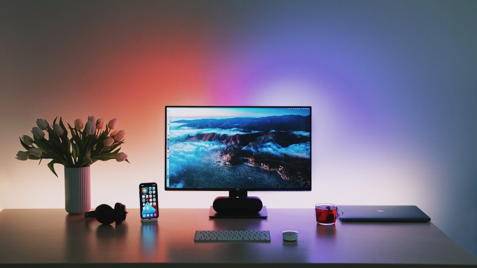

Choosing the right frame shape sets the tone for how your work looks on any screen. Old televisions and many classic monitors used a near-square frame, while modern devices and streaming sites favor a wide, cinematic frame. That simple choice affects composition, mood, and how viewers connect with an image or clip.
- Aspect ratio basics: what width and height mean for your frame today
- What “aspect ratio” means: width to height explained
- 4:3 aspect ratio at a glance: near-square, classic “fullscreen” format
- 16:9 aspect ratio at a glance: widescreen standard for modern media
- Letterboxing vs. pillarboxing: why black bars appear on screens
- 4:3 vs. 16:9: Which Aspect Ratio Is Better for Photos and Videos?
- Photography use cases: portraits, landscapes, and print formats
- Video creation and filmmaking in the present: choosing for story and screen
- Devices and displays: TVs, computer monitors, smartphones, and gaming
- TVs and monitors: industry shift from standard to widescreen
- Smartphones and tablets: how screens shape your viewing experience
- Gaming: competitive field of view, retro nostalgia, and screen fit
- Projectors and presentation screens: picking the right aspect
- Platforms and social media: YouTube, Instagram, TikTok, and beyond
- YouTube, Twitch, Netflix: widescreen as the default viewing experience
- Instagram and Facebook: square, tall, and when near-square still works
- Reels, Stories, TikTok: vertical-first platforms and reframing tips
- How to choose the right aspect ratio now: a practical framework
- Match the platform, device, and content type to your ratio
- Avoiding black bars and distortion: crop vs fit vs reframe
- Conclusion
- FAQ
- What does aspect ratio mean in simple terms?
- Why do black bars appear above or beside my video?
- When should I choose a near‑square frame for photos?
- When is a wide frame the better choice?
- How do resolutions relate to common display sizes like Full HD and 4K?
- Will choosing one shape over another affect file size and clarity?
- How do social platforms influence the best framing choice?
- What’s the best approach for shooting video that will appear on multiple platforms?
- How should gamers and streamers decide what framing to use?
- Can I change the frame shape after shooting without losing quality?
- How do projectors and presentation screens affect my choice?
- Any quick rules to pick the right frame for a project?
Portraits and centered subjects often benefit from the taller frame. Landscapes, group shots, and cinematic scenes shine with a wider sweep. Match your format to the platform you plan to publish on to avoid black bars or forced cropping that hurt the viewing experience.
In this guide, we’ll define terms, show common resolutions, and compare use cases. You’ll get clear, practical advice to pick a proportion that fits both your creative goal and the screens people actually use today.
Aspect ratio basics: what width and height mean for your frame today
The simple W:H notation defines how much horizontal space an image has versus vertical space. Aspect ratio means the proportional relationship of width to height so you can predict how a picture fills a display.
What “aspect ratio” means: width to height explained
Written as W:H, the two numbers tell you the frame shape. Use them to decide crop, composition, and the final look on common screens.
4:3 aspect ratio at a glance: near-square, classic “fullscreen” format
Near-square formats once matched old TVs and monitors. Common resolutions include 1024×768 (XGA) and 800×600 (SVGA), which still appear in legacy devices and some tablets.
16:9 aspect ratio at a glance: widescreen standard for modern media
Widescreen drives modern content. Typical sizes are 1920×1080 (Full HD), 2560×1440 (QHD), 3840×2160 (4K), and 7680×4320 (8K).
Letterboxing vs. pillarboxing: why black bars appear on screens
When shape and display don’t match, black bars protect the original composition. Pillarboxing adds bars left/right; letterboxing adds bars top/bottom. Bars prevent stretching and keep proportions intact.
- Use the W:H numbers to match device screens.
- Preserve original shape to avoid distortion.
| Format | W:H | Common resolution | When it appears |
|---|---|---|---|
| Near-square fullscreen | 4:3 | 1024×768 (XGA) | Old monitors, some tablets |
| Widescreen HD | 16:9 | 1920×1080 (Full HD) | TVs, streaming, modern monitors |
| Ultra HD | 16:9 | 3840×2160 (4K) | High-end displays, video production |
4:3 vs. 16:9: Which Aspect Ratio Is Better for Photos and Videos?
How you frame a shot decides whether the subject feels intimate or expansive. Field of view changes composition, telling different stories with the same scene.
Field of view and composition
4:3 aspect ratio often emphasizes vertical detail and a centered subject. It works well for portraits, tabletop shoots, and any image that benefits from tighter height.
16:9 aspect ratio offers a wider sweep that favors landscape and action across the horizontal plane. It opens space at the edges and changes how viewers read movement.
Common resolutions and sizes
Expect classic 4:3 sizes like 640×480 (VGA), 800×600 (SVGA), and 1024×768 (XGA). Widescreen options include 1280×720 (HD), 1920×1080 (Full HD), 2560×1440 (QHD), 3840×2160 (4K), and 7680×4320 (8K).
Bitrate, file size, and clarity
Higher resolutions mean more clarity but also higher bitrate and larger files. A 4:3 frame can be more efficient due to fewer pixels, while a 16:9 frame at HD or above delivers more cinematic fidelity and demands more storage.
- Composition trade-off: tight vertical framing versus wide horizontal storytelling.
- Edge content changes the emotional focus of a scene.
- Choose size and resolution based on delivery needs and bandwidth limits.
| Format | Representative resolution | When to pick |
|---|---|---|
| Near-square | 1024×768 | Portraits, legacy screens |
| Widescreen HD | 1920×1080 | Streaming, landscape, action |
| Ultra HD | 3840×2160 | Cinematic detail, high-end delivery |
Photography use cases: portraits, landscapes, and print formats
Your framing choice guides the story a picture tells. That decision affects mood, balance, and what remains on the edges. Below we break down practical uses so you can pick a format that fits the subject and final output.
Portraits, product shots, and centered subjects
The 4:3 aspect ratio often suits headshots, portraits, and ecommerce listings. It keeps attention on a centered subject and preserves vertical detail like full-body poses or stacked product arrangements.
Tips: leave headroom, protect side margins, and frame slightly wider to allow safe crops for different layouts.
Landscapes, architecture, and group photos
The 16:9 aspect ratio favors wide scenes. Use it for sweeping views, interiors, and groups where horizontal space helps tell the story without awkward cuts.
For travel and real estate, the wider format captures context and gives a panoramic feel that prints well at large sizes.
- Print planning: pick the format that matches common paper sizes to avoid heavy cropping.
- Catalogs and ecommerce: consistent 4:3 frames aid visual hierarchy across listings.
- Workflow tip: shoot wider and keep safe margins to export multiple aspect options.
| Use case | Recommended format | Why it works | Print note |
|---|---|---|---|
| Portraits, headshots | 4:3 aspect | More vertical detail, tighter focus | Matches classic print sizes |
| Landscapes, panoramas | 16:9 aspect | Wider view, cinematic feel | Good for large panoramic prints |
| Product catalogs | 4:3 aspect | Consistent product framing | Avoids odd crops across listings |
Video creation and filmmaking in the present: choosing for story and screen
Modern streaming and playback systems favor a wide image that fits common screens. This has shaped how creators plan shoots, edit timelines, and export final masters.
Today, services like YouTube and Netflix plus modern TVs and monitors default to a widescreen format. The 16:9 aspect ratio rose with HDTV and now supports Full HD and 4K with little fuss.
Why the widescreen standard matters
Delivery is simpler when your footage matches platform defaults. Encoding presets, player interfaces, and thumbnails expect this shape, so uploads behave predictably.
- Platform defaults reduce cropping and black bars on most displays.
- Editors and compressors include presets tuned to widescreen outputs.
- Many tutorials, interviews, and live streams pick widescreen to fit overlays and side-by-side content.
- Legacy footage or vertical campaigns are valid exceptions; plan framing to avoid reshoots.
| Use case | Why pick widescreen | Delivery note |
|---|---|---|
| Streaming shows | Matches audience screens | Minimal letterboxing |
| Tutorials / interviews | Clear overlays and side content | Easy export presets |
| Artistic films | Can break standard intentionally | Expect extra mastering work |
Choose the standard when you want a smooth workflow and consistent delivery. Break convention when a unique frame strengthens the story, but plan how that choice will display on the target platform and screens.
Devices and displays: TVs, computer monitors, smartphones, and gaming
Device trends have pushed media toward wider frames, shaping composition and delivery.
TVs and monitors: industry shift from standard to widescreen
Most modern tvs and monitors now use a widescreen default. The move away from the classic 4:3 aspect ratio left near-square displays rare.
This standard stuck because streaming, broadcast, and content tools aligned on one shape. That makes delivery and encoding simpler across common screens.
Smartphones and tablets: how screens shape your viewing experience
Smartphones often sit vertically, but video plays best in landscape on many devices. Creators frame content with this in mind to avoid black bars and awkward crops.
When playback and device shape don’t match, bars appear to preserve proportions—pillarbox at left/right for narrow source, letterbox top/bottom for wide source.
Gaming: competitive field of view, retro nostalgia, and screen fit
Modern titles tend to favor wider fields of view on 16:9 displays, giving extra horizontal awareness in multiplayer games like PUBG and Fortnite. That can offer a real advantage in play.
Retro releases often target the older near-square format to keep authentic look and feel. Emulators and settings let players choose which display behavior they prefer.
Projectors and presentation screens: picking the right aspect
Projectors and conference screens default to widescreen because slides and video assets usually match that shape. To avoid cut-off charts, set both source and display to the same aspect before showing.
- Tip: Test playback on the actual device ahead of any live event.
- Tip: When editing mixed footage, pick one master format to reduce rework and keep overlays aligned.
| Device | Typical display | Note |
|---|---|---|
| TVs | Widescreen (16:9) | Minimal letterboxing on modern content |
| Computer monitors | Widescreen | Good for editing and playback presets |
| Smartphones | Variable; vertical often | Landscape video still common for most platforms |
Platforms and social media: YouTube, Instagram, TikTok, and beyond
Each social platform nudges creators toward a preferred frame. Pick a delivery format that suits the target audience to avoid awkward crops and low engagement.
YouTube, Twitch, and Netflix default to a widescreen player. Uploads that match the 16:9 aspect display cleanly with fewer black bars. Retro streams can use a 4:3 aspect for stylistic effect, but most creators stick to the widescreen standard.
YouTube, Twitch, Netflix: widescreen as the default viewing experience
Use 16:9 for uploads to ensure thumbnails, autoplay previews, and player fills on most screens.
Instagram and Facebook: square, tall, and when near-square still works
Feeds prefer 1:1 and 4:5 portrait. A near-square edit can fit here, but test thumbnails and cropping before posting.
Reels, Stories, TikTok: vertical-first platforms and reframing tips
Stories and short-form apps reward 9:16. Non-vertical files may be padded with black bars or shown smaller on smartphones, which lowers impact.
- Practical tip: shoot with safe margins so a wide master can be reframed to vertical.
- Quick fix: protect faces and main action near center when composing for multi-platform campaigns.
| Platform | Recommended format | When to use | Delivery note |
|---|---|---|---|
| YouTube / Netflix | 16:9 | Long-form streaming, cinematic uploads | Best fill on widescreen players; clean thumbnails |
| Twitch | 16:9 (4:3 for retro) | Live streams, gaming; retro streams may use near-square | Most viewers expect widescreen; test chat overlays |
| Instagram Feed / Facebook | 1:1 or 4:5 | Portrait posts, consistent grid look | Crops affect thumbnails; choose safe framing |
| Reels / Stories / TikTok | 9:16 | Short-form vertical content | Vertical-first; non-vertical uploads get black bars or shrink |
How to choose the right aspect ratio now: a practical framework
Start by picking the main destination where most viewers will watch your work. Align your master edit to that platform so your final files need minimal rework. A platform-first plan protects composition and speeds delivery.
Match the platform, device, and content type to your ratio
Right aspect ratio depends on where the audience consumes media. If streaming on a large screen, pick a wide master. For mobile-first short clips, choose a tall master and reframe as needed.
Shoot a bit wider than needed to keep headroom and side margin. That safe margin makes it easy to crop or reframe without losing key action.
Avoiding black bars and distortion: crop vs fit vs reframe
Fit preserves the original shape and adds bars so nothing stretches. Crop fills the frame but may cut edges. Reframe repositions the subject inside a new size to keep essentials visible.
- Decision tree: pick main platform → pick master size → add safe margins → export alternates.
- Practical example: set a widescreen master for YouTube, then extract a vertical cut for mobile reels.
- Protect text and graphics by keeping captions inside a safe area for all devices.
- Use templates and guides so subject placement stays consistent across different aspect choices.
| Step | Action | Why it helps |
|---|---|---|
| Choose platform | Pick the dominant delivery device | Prioritizes the viewing experience |
| Shoot safe | Frame wider than final size | Allows cropping and reframing |
| Export alternates | Fit, crop, reframe per target | Reduces surprises and rework |
Conclusion
Choose a format that protects composition and fits the platforms where viewers will watch. Both 4:3 and 16:9 remain useful today. The 4:3 aspect ratio echoes classic tvs and early computer monitors and favors vertical focus. The 16:9 aspect ratio matches modern displays, streaming services, and wide landscape work.
Plan a master edit with safe margins so you can reframe without losing the top bottom or side details. That step helps avoid black bars and odd crops when moving between screens and devices.
In short, match your intent to the target device and platform. Pick the frame that serves the story, then export alternates to keep your videos and photos looking right on any screen.
FAQ
What does aspect ratio mean in simple terms?
Aspect ratio describes the proportional relationship between a frame’s width and height. It tells you how wide a photo or video looks compared to its height, which affects composition, cropping, and how the image fills different screens.
Why do black bars appear above or beside my video?
Black bars show up when the media’s proportions don’t match the display’s proportions. Letterboxing adds bars top and bottom for wider formats on narrower screens; pillarboxing adds bars left and right for taller formats on wider screens. They preserve the original framing without stretching or cropping.
When should I choose a near‑square frame for photos?
A near‑square frame works well for portraits, product shots, and any subject where vertical detail or centered composition matters. It helps maximize vertical space and often prints nicely for standard photo formats.
When is a wide frame the better choice?
A wide frame suits landscapes, architecture, cinematic scenes, and group photos. It captures more horizontal context and matches modern TVs and monitors, giving a more immersive, cinematic feel on those screens.
How do resolutions relate to common display sizes like Full HD and 4K?
Resolutions pair with aspect choices: many modern TVs and monitors use widescreen standards, while older or camera-native modes may use more square-like resolutions. Higher resolutions such as Full HD and 4K provide more detail regardless of proportions, but the frame shape still determines what’s visible.
Will choosing one shape over another affect file size and clarity?
The frame shape affects pixel count distribution, which can change perceived clarity for certain subjects. File size depends on resolution, bitrate, and compression settings rather than shape alone. Wider cinematic framing can need higher bitrates to keep fine horizontal detail looking sharp.
How do social platforms influence the best framing choice?
Platforms optimize for specific formats: video streaming sites and most smart TVs favor widescreen, while social apps often use square or tall frames for feeds and stories. Match the platform’s preferred orientation to reduce cropping and black bars and to keep important content visible.
What’s the best approach for shooting video that will appear on multiple platforms?
Frame for the most important area of the shot, then shoot at higher resolution so you can safely crop or reframe for different formats. Use safe zones and avoid placing crucial elements at the extreme edges to prevent loss during conversions.
How should gamers and streamers decide what framing to use?
Competitive gamers often pick wider views for more horizontal field of view and immersion, while retro or handheld captures may benefit from more square proportions. Consider your platform, audience display, and whether overlays or chat panels will affect visible space.
Can I change the frame shape after shooting without losing quality?
You can crop or reframe if you shot at higher resolution, but enlarging a cropped area reduces quality. Reframing works best when you plan ahead by keeping extra space around the subject and shooting at resolutions that allow flexibility.
How do projectors and presentation screens affect my choice?
Presentation screens and projectors often follow widescreen standards now, so using a matching frame avoids black bars and stretching. If you expect older equipment, consider exporting multiple versions or using letterboxing to preserve composition.
Any quick rules to pick the right frame for a project?
Match the target device and platform first, prioritize the subject’s orientation second, and shoot at higher resolution third to allow safe crops. That sequence keeps your work flexible and compatible across displays.